
Understanding Candlestick Charts: A Beginner’s Guide

In the world of investing and trading, data is king. But raw data alone is like a pile of uncut gems – valuable, yet overwhelming. This is where candlestick charts come into play, turning data into a story that even beginners can understand and use to make informed trading decisions.
What are Candlestick Charts?
Candlestick charts are a visual tool used in technical analysis to track the price movements of securities over time. Originating from 18th-century Japan, where they were used for trading rice, these charts have stood the test of time and are now a staple in financial markets worldwide.
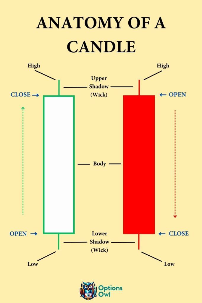
Anatomy of a Candlestick
Each candlestick provides four key pieces of information: the opening price, closing price, high, and low of a given time period.
- The Body: This is the wide part of the candlestick. If the closing price is higher than the opening price, the body is often colored in a lighter shade (commonly white or green), indicating an upward movement or a ‘bullish’ trend. Conversely, if the closing price is lower, the body is darker (black or red), indicating a downward or ‘bearish’ trend.
- The Wicks: Also known as ‘shadows,’ these thin lines above and below the body represent the high and low price ranges within the time frame. The top of the upper wick shows the highest price, and the bottom of the lower wick shows the lowest price.
Interpreting Candlestick Patterns
Candlestick charts are popular because of their ability to display a wide array of information in a compact form. Here’s how you can start interpreting basic patterns:
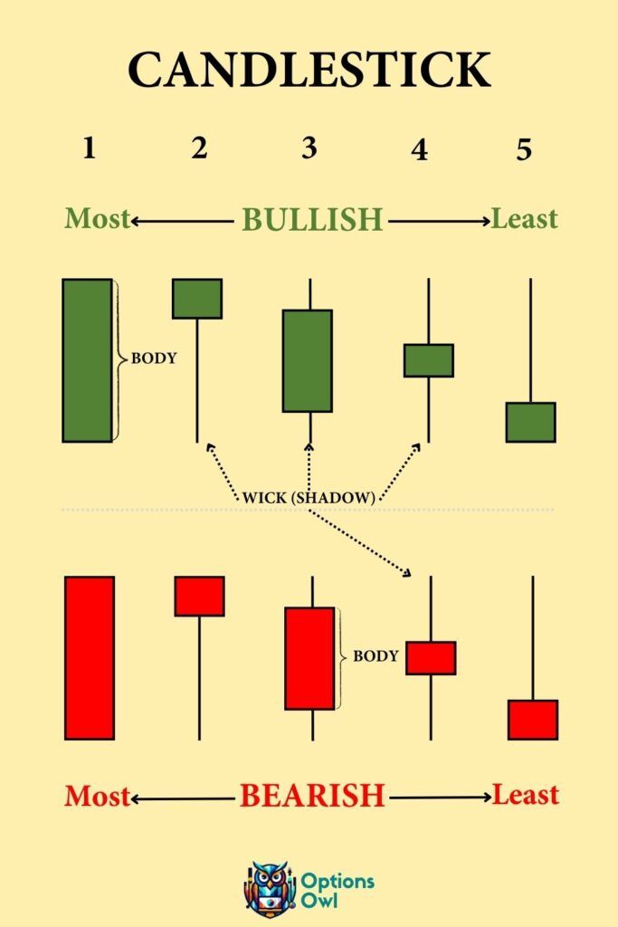
- Single Candlestick Patterns: Even a single candlestick can provide valuable insights. For instance, a candlestick with a long lower wick and a short body at the top suggests that the price dropped significantly but then rebounded.
- Multiple Candlestick Patterns: When combined, candlesticks can form patterns that traders use to predict future movements. The ‘Bullish Engulfing’ pattern, for instance, consists of a small, dark candlestick followed by a larger, light candlestick, signaling a potential upward trend.
Why are Candlestick Charts Important?
- Clarity: They turn complex data sets into understandable visual patterns.
- Prediction: Though not foolproof, candlestick patterns can indicate potential market turns and continuations.
- Flexibility: They can be used for various time frames, from minutes to months.
- Complementing Other Analysis: Candlestick charts are often used alongside other forms of technical analysis to confirm theories or signals.
Tips for Beginners
- Start with Basic Patterns: Before diving into complex combinations, familiarize yourself with basic single and dual candlestick patterns.
- Use in Combination: Don’t rely solely on candlestick patterns. Use them in conjunction with other indicators and fundamental analysis.
- Practice and Patience: Like any skill, interpreting candlestick charts takes practice. Start with virtual trading or small amounts to test your understanding.
- Keep Learning: The world of technical analysis is vast. Continuously educate yourself to enhance your trading skills.
Conclusion
Candlestick charts are a valuable tool for understanding market sentiment and potential price movements. For beginners, mastering these charts opens up a new dimension of market analysis, allowing for more informed and confident trading decisions. Remember, the key is to use them as part of a broader strategy, balancing technical insights with sound risk management.